top of page
Typographic Adaptation & Illustration
PEPSICO LETTERING
Typographic adaptation and illustration for a PepsiCo campaign, created with Villavicencio Studio.

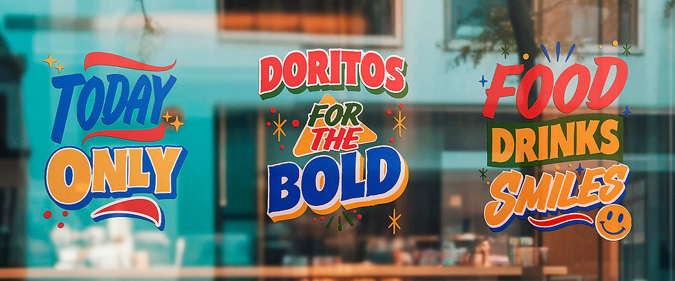
Two existing typefaces were modified to give them a hand-drawn feel, complemented by illustrations and decorative elements.
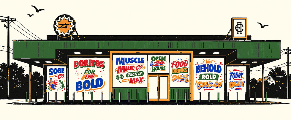
Color and composition
The color palette brings energy and cohesion to the series, while illustrated details give each composition its own character.


The lettering is woven into the campaign scenes, interacting with people, products, and their surroundings.


A graphic language that makes typography an active part of the image.
bottom of page